Ytskyddsdagarna

    Guidelines

    Short rules for using our brand consistently and correctly.

    Clear space

    Always leave at least one letter height of clear space around the logo so it can breathe.

    Ytskyddsdagarna logo
    Correct
    • Always use an approved logo variant.
    • Keep clear space around the logo — at least one letter height.
    • Use our official colour values.
    • Pair Barlow for headings with DM Sans for body copy.
    Don't
    • Do not alter the logo's colour, rotation or proportions.
    • Do not place the logo on low-contrast backgrounds.
    • Do not add shadows, glows or other effects.
    • Do not use typefaces other than Barlow and DM Sans.
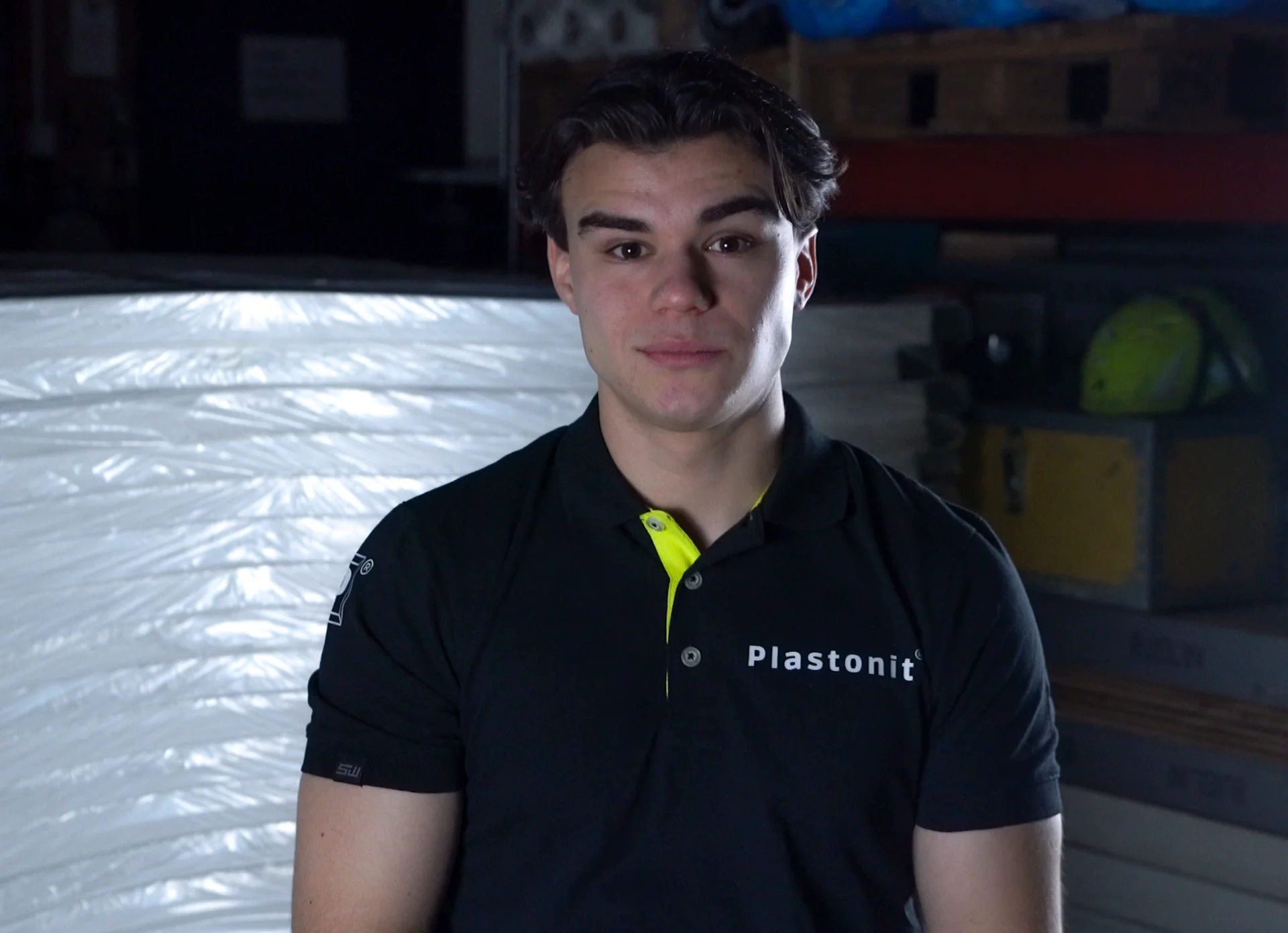
    Oliver Larsson Kostovski

    Can't find what you're looking for? Don't hesitate to contact me and I'll help you!

    Oliver Larsson Kostovski

    Coordinator